Brand Kit
Official logos, colors, and typography for The Queenager Chronicles. Use these assets consistently across all platforms and materials.
Logo Variations

Crown Q — Gold on White
Primary Crown Q mark — light backgrounds, print, stationery, packaging
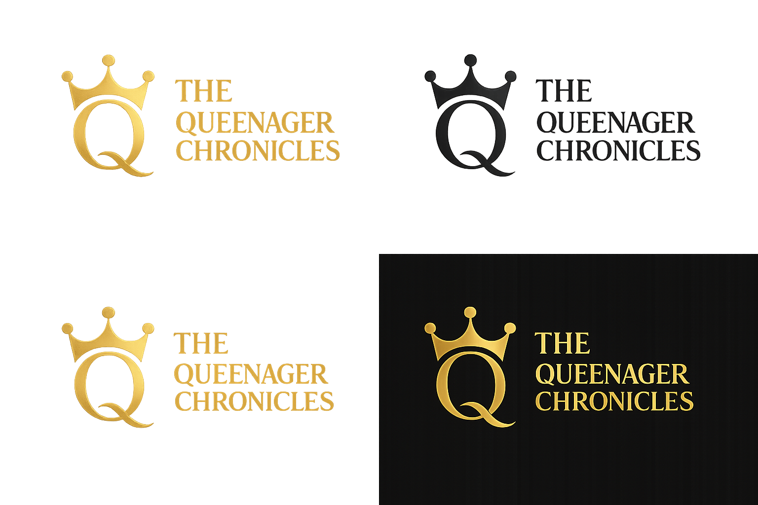
TQC Full Logo — All Variations
Complete logo sheet: gold on white, black on white, gold on black — all orientations

Crown Q — Dark Badge Icon
App icon, favicon, social profile, stickers, embroidery

Crown Q Logo — Horizontal
Primary brand logo — headers, email signatures, banners, social profiles, merch tags

Badge Logo — Horizontal
Primary brand logo — headers, email signatures, banners, merch tags

Badge Logo — Stacked
Stacked version — tote bags, tees, signage, social media

Crown Icon Mark
Standalone crown — embroidery, stamps, profile photos, caps

Wordmark — Horizontal
Elegant serif wordmark — fashion collabs, editorial, packaging
Wordmark — Stacked
Stacked wordmark — hoodie chest print, journal cover, mugs
Logo Usage Guidelines
- Always maintain clear space around the logo equal to the height of the crown
- Do not stretch, rotate, or alter the logo proportions
- Use the dark version on light backgrounds and the light version on dark backgrounds
- Minimum size: 120px wide for digital, 1 inch for print
- Do not place the logo over busy or low-contrast backgrounds
Brand Colors
Queenager Gold
Primary brand color — headlines, CTAs, accents
#D4A843
Crimson
Secondary — borders, badges, depth
#6B1A2E
Deep Plum
Accent — hover states, highlights
#8B1A4A
Midnight
Background — primary dark canvas
#080008
Deep Black
Background — section alternates
#060006
Cream
Foreground — body text, light surfaces
#F0EAE8